
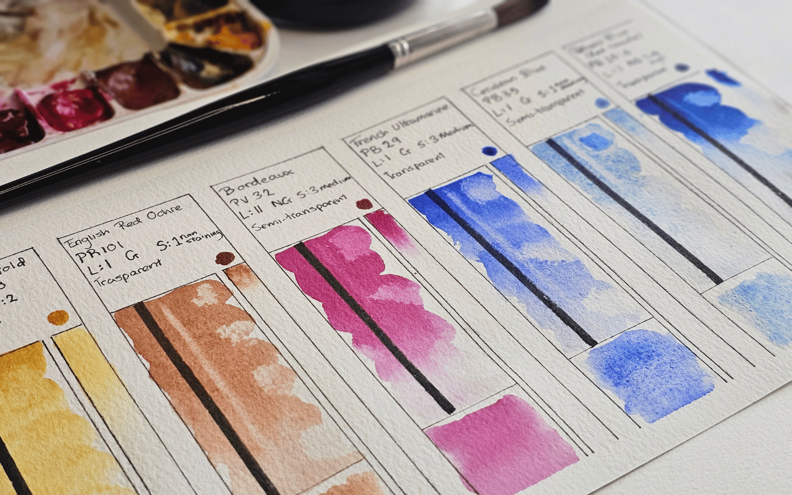
If you’re interested in watercolor painting, then I’m sure you’ve seen plenty of artists making paint swatches.
You may have also noticed that each artist does it differently, jotting down different pieces of information.
So how do you know whether you should swatch your paints too? If so, what exactly do you need to know and what do you need to leave out?
In the next few minutes, I’m going to answer exactly that!
Watercolor Swatches & Their Importance
Watercolor swatches are color charts that allow you to test and evaluate your paints. They reveal exactly how each color behaves.
This information can help the artist select the right pigments and get the most out of their colors.
For example, if you want to paint sand and beach texture using granulating paints, you can easily reference your swatch cards to see which colors you can use.
What to include in a watercolor swatch
There are about 7 watercolor paint qualities to test for, including:
- Transparency
- Granulation
- Staining qualities
- Level of dispersion (diffusion)
- Masstone
- Undertone
- Lightfastness
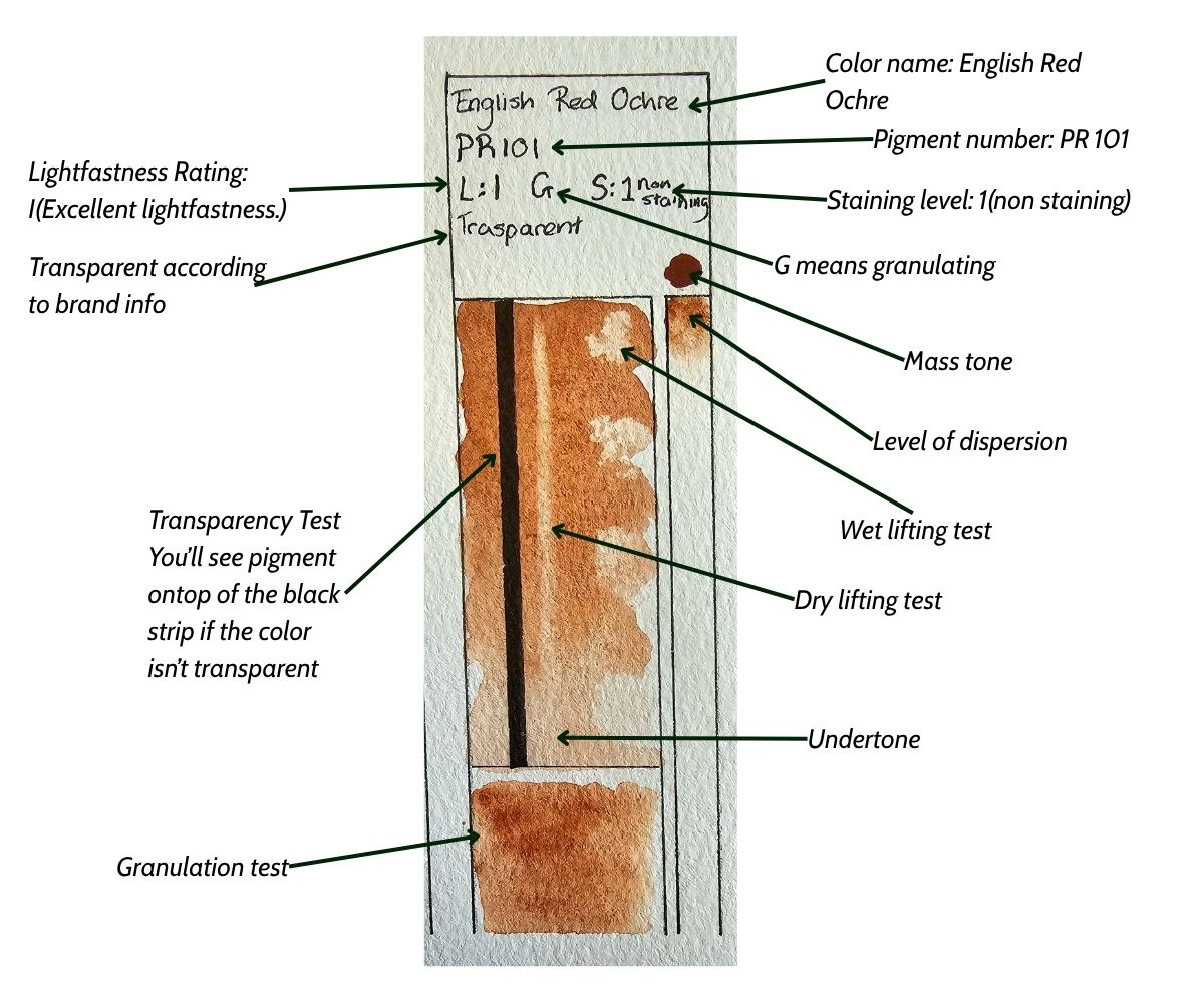
Let’s begin by going through each quality, learn what each one is, and how you can test for it. I’ll then show you how to swatch your colors and what to do with the information.
Transparency/opacity
One of the characteristics of watercolor paint is that it’s transparent. Meaning, when you apply a layer of paint on a previous layer, the previous layer can be seen through.
If you add a new layer onto the paper, the light can still travel through the layer of paint, reflect off the white of the paper, and create a beautifully luminous effect.
Some pigments are more transparent than others. This is why testing for transparency can come in handy; you will know beforehand which colors to use when layering.

Granulation
To make watercolor paint, the pigment is ground into a smooth, fine powder. However, some pigments have larger grains than others.
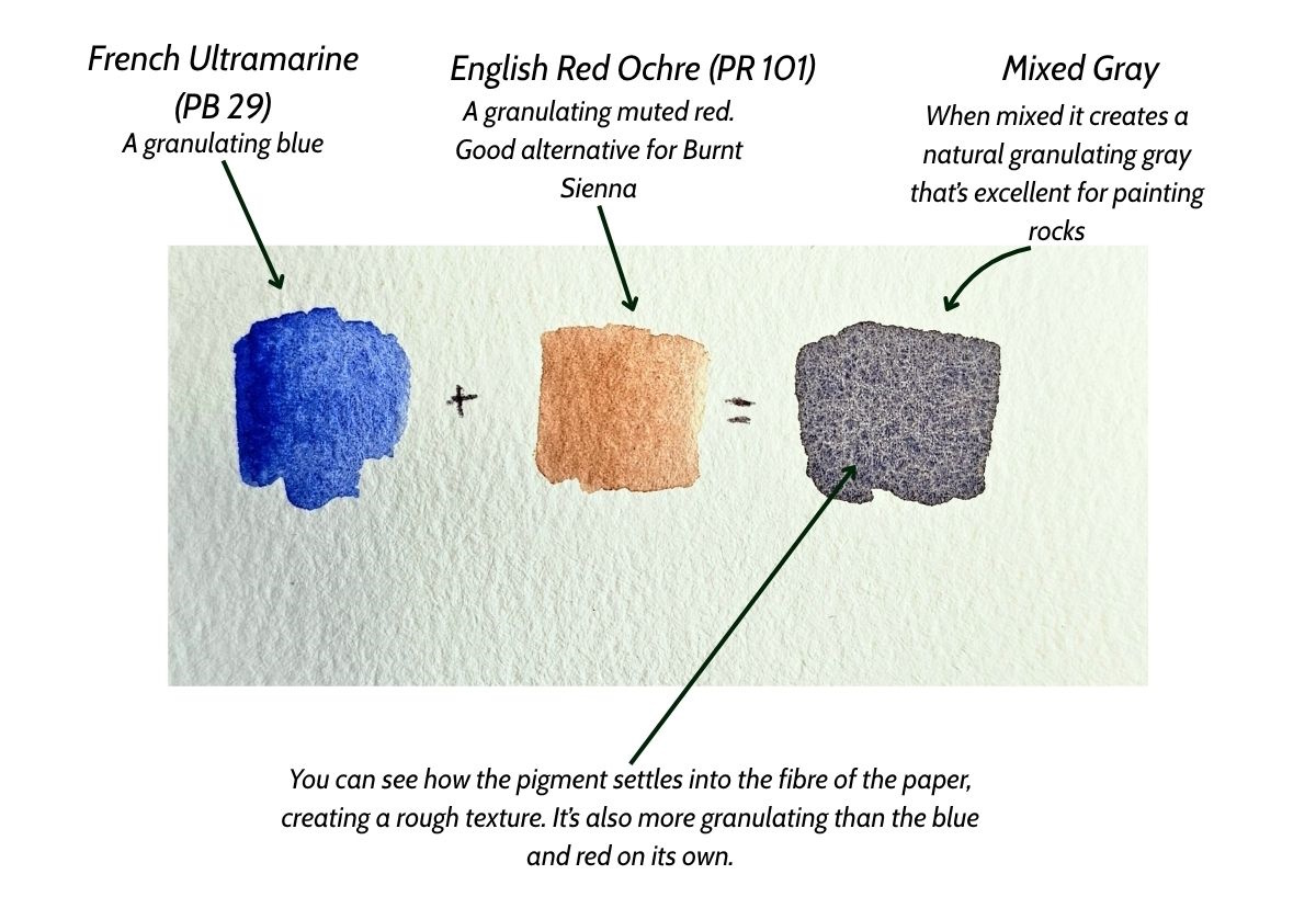
When the layer of paint is drying, the pigment separates and sinks into the wells of the paper to form a textured dotted effect as shown in the image below. This process is called granulation.
Different colors granulate on the paper at different rates. This is because while some pigments are easier to grind into a fine powder, others are harder and create slightly grainy results. A good example of this is Ultramarine or Cerulean blue.

Staining qualities
One of the fundamental techniques of watercolor painting is to lift the paint. Staining colors are paints that, when you work with them, the paint is absorbed by the paper and becomes difficult to rewet, remove, or rework.
Some pigments are “non-staining”, meaning they can be lifted off the paper with little to no effort. This is especially useful when lifting the highlights of a painting!I
Most watercolor brands usually include whether a color is staining or non-staining on their website or the paint label itself.
However, it’s important to test this yourself; that way you can have a chart for reference and compare colors easily. You can also test for lifting wet paint and rewetting and lifting paint.

Below is a color staining scale so you can know which colors are highly staining vs non-staining:
1. Non-Staining: Pigment sits on top of the paper, allowing you to lift or scrub it back to white easily when wet or dry.
2. Low Staining: Pigment leaves a faint tint when you try to lift it from the paper.
3. Medium Staining: Pigment leaves a moderate color trace and is hard to remove completely.
4. High Staining: Pigment settles firmly into the paper fibers and cannot be lifted out, making it ideal for glazing but permanent
Level of dispersion (diffusion)
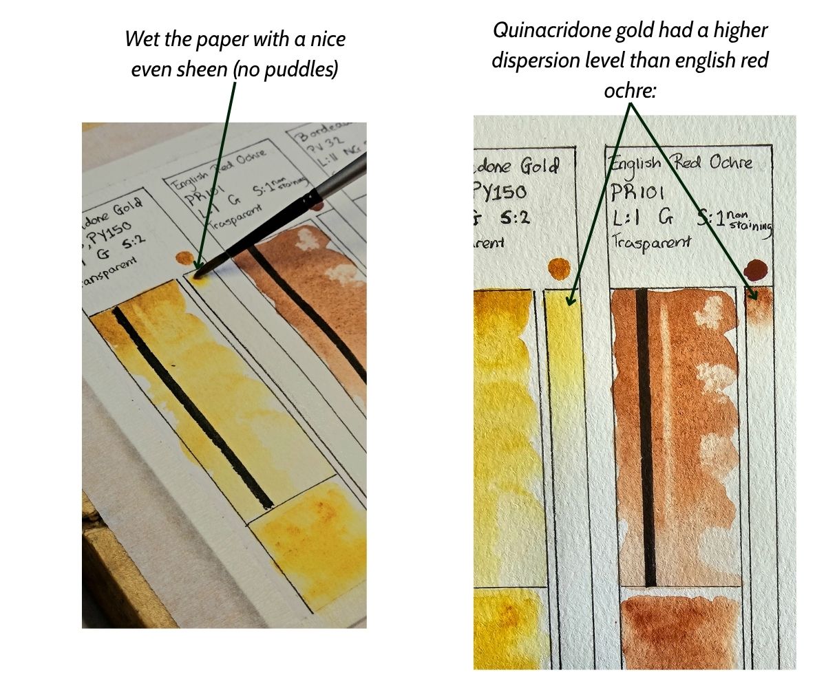
Watercolor paint tends to “bleed” when you paint into wet paper. The level of dispersion refers to how quickly and how far the pigment spreads when painting.
This is useful information because colors that spread farther and more quickly will mix with other colors more than pigments that don’t really spread out.
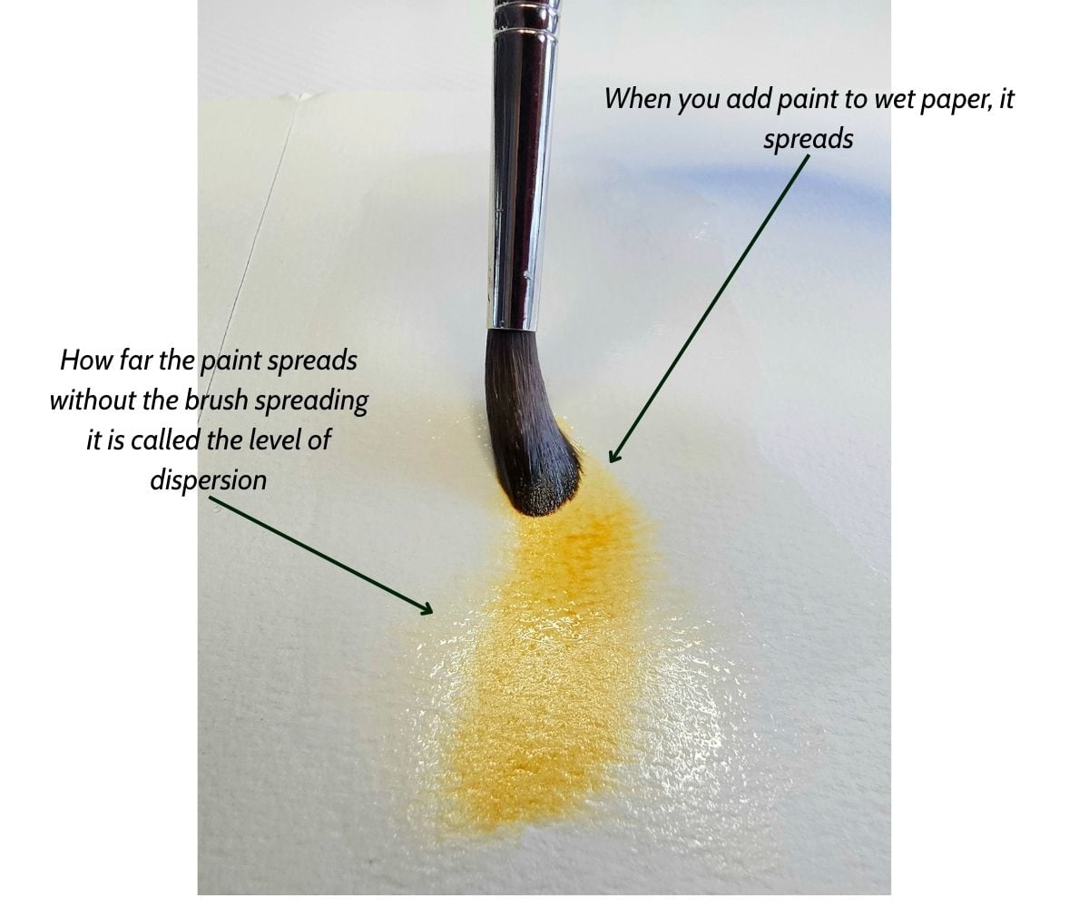
When trying to paint sunsets, you don’t want yellow and blue to create green after painting them close together. Choosing colors that have low dispersion is very handy in this case.
Masstone/Undertone
Mass tone and undertone, also referred to as “Hue shift”, are terms to describe what the paint looks like straight from the tube (saturated) compared to what it looks like watered down (diluted).
Mass tone- Saturated paint from the tube
Undertone- Diluted, watered down version of the paint
This is a paint quality that can help you determine what a color will look like on your painting when watered down vs saturated.
Lightfastness
Lightfastness, also referred to as permanence, refers to how durable the paint is in a given time frame when exposed to light.
Permanence happens because of exposure to light; the chemical bonds of the paint begin to break. This happens over a certain period, which causes the watercolor paintings to fade, darken, or become discolored over time.
Companies usually include a “permanence rating,” which indicates the level of durability the pigment has against light exposure.
Here’s how Daniel Smith’s lightfastness ratings are read:
I: Excellent lightfastness. The color stays stable for 100+ years. Best for professional artwork.
II: Very good lightfastness. The color lasts about 100 years. Good for most art.
III: Fair lightfastness. The color fades over time (50 to 75 years). Avoid for long-lasting permanent work.
IV – V: Poor or fugitive lightfastness. The color will fade within months or a few years
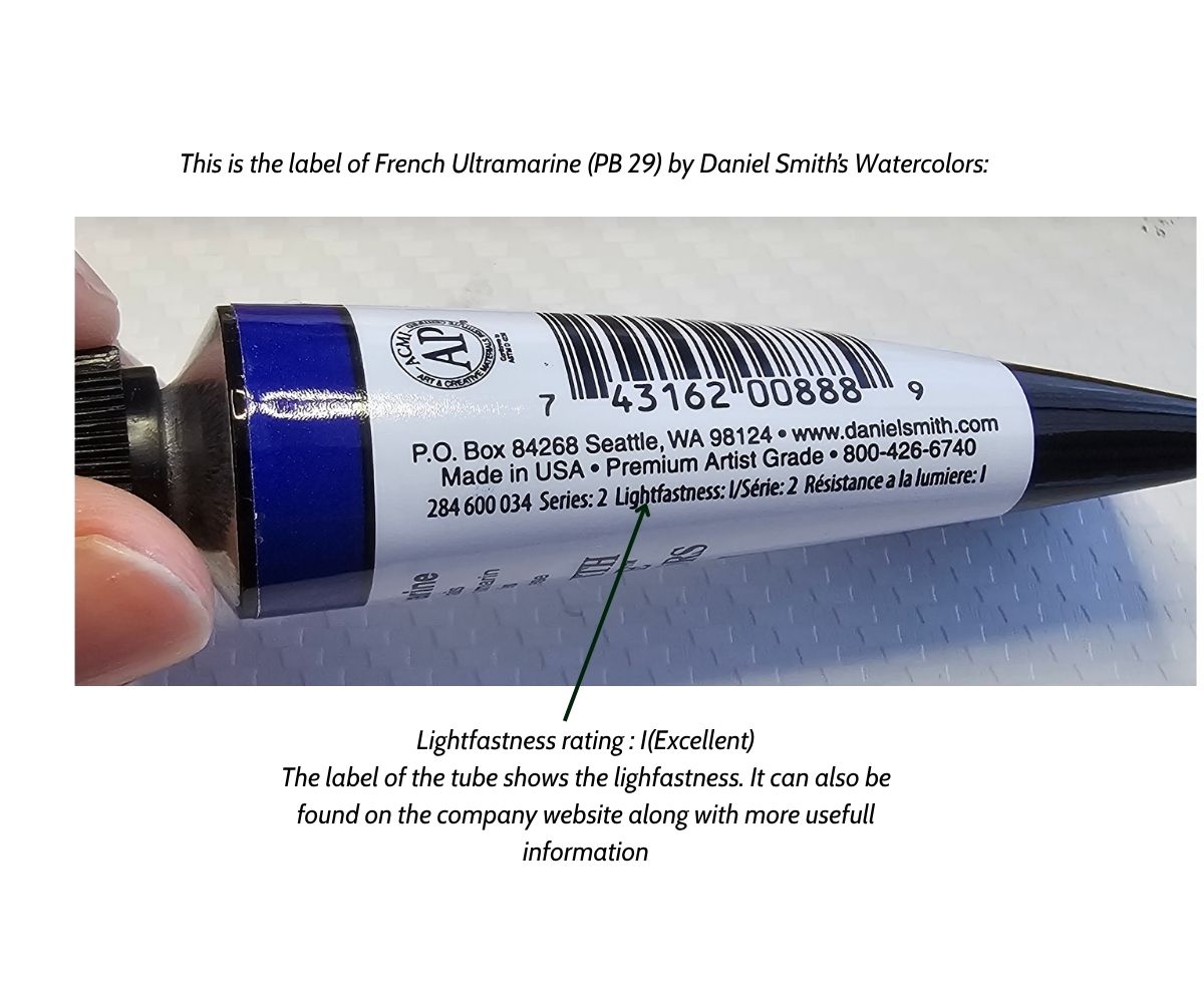
The rating is usually written on the label or the company’s website and changes between brands. However, you can test this for yourself.
I don’t usually test for lightfastness myself because it takes a lot of time, and I find the rating on the label is enough
How to test for Lightfastness?
You can test the lightfastness by swatching the color you want to test and then putting it in a place where it’s exposed to direct sunlight.
After a certain amount of time, you can then paint a fresh swatch of the same colors and note down if there are any differences. Because different colors have different permanence ratings, it may take much longer to see any difference with certain colors.
How to Create a Watercolor Swatch (Quick Exercise)
Now that you know exactly what qualities to test for, it’s time to make a swatch chart. After making dozens of swatches, I found this method was the most efficient way of testing for all the paint qualities in as little time as possible.
It’s great because you can have all the information you need in one spot.
Let’s go through the process of making watercolor swatches step by step:
Materials
- Watercolor Paints– The paints that you want to test (tube or pans)
- Watercolor Paper– Make sure you use good quality paper, the one you normally paint with
- Brushes– The brush that you use the most (a medium sized round brush will do)
- 2 Jars of water– One for rinsing and one for loading your brush
- Paper towel – For dabbing excess moisture from your brush and lifting paint
- HB Pencil/Pen- To draw the chart outline.
Draw The Chart Outline
You’ll have to adjust the size of your paper and chart depending on how many colors you are going to swatch.
Draw a small box to write the label; this will include the brand name, paint color, pigment numbers, granulation, staining, and lightfastness properties.
Don’t fill them in just yet.
If all the colors you’re testing are from the same brand, then you can write the brand name at the top of the paper instead of repeating it over and over.
The second step is to draw the main rectangular box; this is where you’ll do a graded wash and test for staining, transparency, and range of values. Leave a small space below the bottom right part of the label box.
Below the main box, you’ll draw one box for the granulation test. To the right, you’ll draw a long rectangular strip for the dispersion test.
Here’s an image of what your chart should look like:
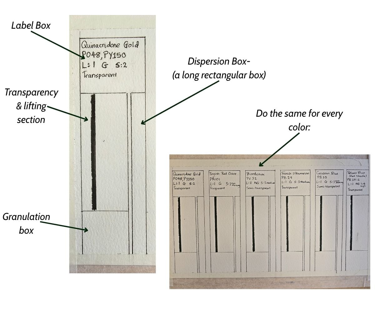
I’d use pencil to draw the box, then go over it with a waterproof pen(this is optional).
Fill in the labels
Start by writing the paint color name, pigment numbers, lightfastness rating, granulation, and staining information.
The Daniel Smith tube labels always include color name, pigment numbers, and lightfastness rating. The staining and granulation can be found on their website.
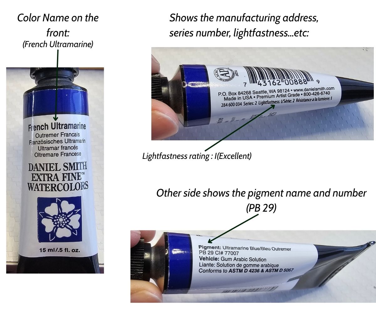
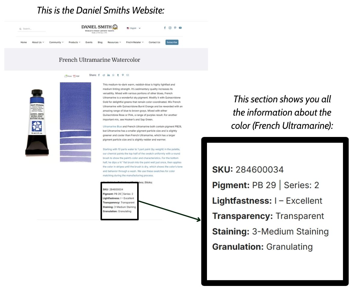
The next step is to paint the mass tone; do this by picking up paint from the tube and painting a dot in the label box. This shows the color when it’s most saturated (Mass tone).
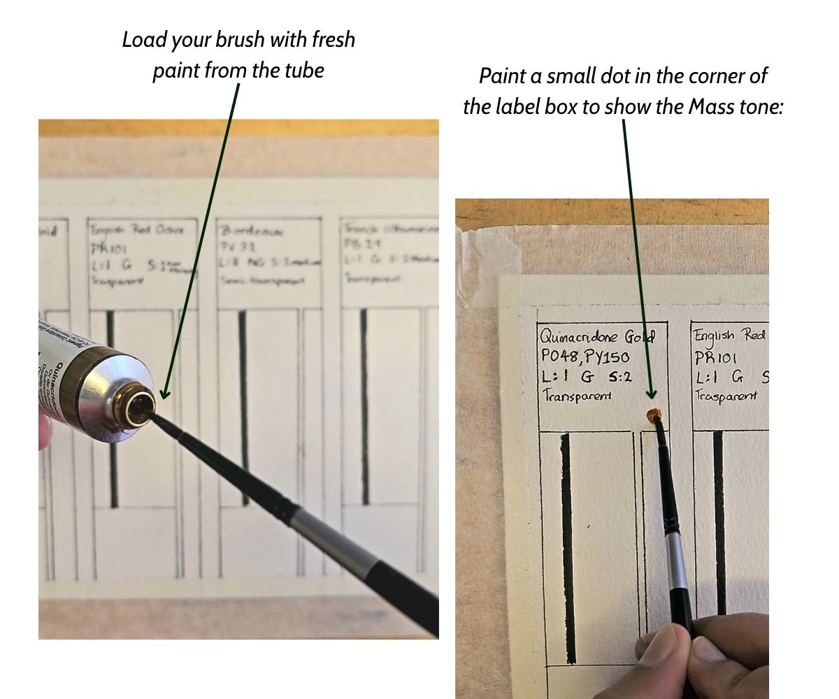
How to test for watercolor transparency and staining:
To test for transparency, you’ll need a waterproof black marker and draw a vertical line in the box:
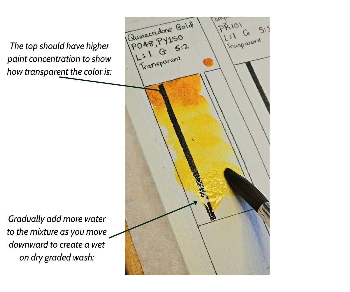
Start by painting a vertical graded wash. Start with a saturated mix and gradually increase the amount of water in the mixture as you move downwards.
How to test for Staining properties
While the paint is still wet, fold a paper towel and lift a small dab of paint at the top of the wash, shift to a clean part of the paper towel and lift from the middle and bottom of the wash.
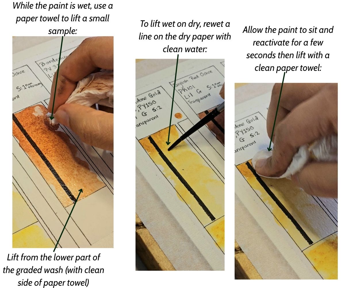
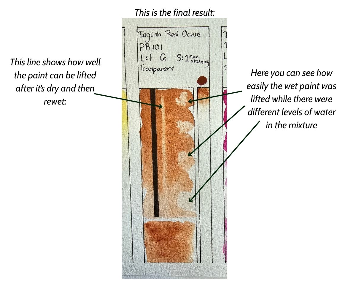
This shows how well the wet paint can be lifted with different water and paint ratios. Let the graded wash dry completely.
For the second lifting test, make sure the paint is dry, then with the tip of your brush rewet a vertical line. Make sure you allow the pigment to reactivate properly, and then, using a paper towel, lift the paint.
How to test for watercolor granulation
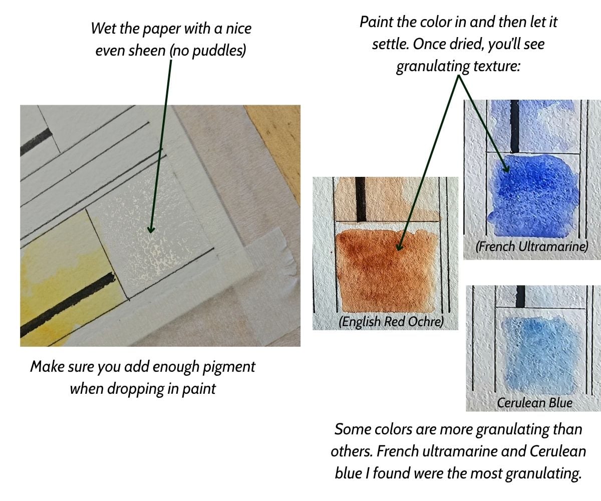
To test for granulation, you have to wet the paper and then drop some paint wet into wet.
Now, all you have to do is wait for it to dry to see the results. Using rough textured paper or cold-pressed paper will be more effective than hot-pressed.
You’ll notice the paint settling into the wells of the paper to create a rough textured effect:
Diffusion test
Here’s the step by step on how to test for the level of dispersion:
- Draw long rectangular boxes which will be your test strips. Make sure each box is the same size for more accuracy (you can measure them).
- Wet the first box with clean water and load your brush with the color you want to test. A nice even sheen with no puddles should do.
- Drop the color into the box from the top end by dabbing 2 to 3 times.
- Let the pigment dry without disturbing it. As it’s drying, you’ll be able to see how far the pigment travels across the test strip
- For more accuracy, try to wet the boxes with the same amount of moisture. Only work with one box at a time.
How to Compare & Analyse Swatches
Now comes the next stage. You’ve made your swatch charts; what do you do with the information?
Your swatch cards have enough insight to help you judge which colors will perform well for a specific project.
It all depends on what you are trying to achieve in your project.
A color may not make it into the selection if the paint is unpredictable, low quality, or simply unsuited to your specific needs.
Painting lakes and rivers
When I paint water, I prefer to be able to lift the paint off the paper; for me, this means choosing less staining colors. From my colors, I may not use Prussian blue, or only use it when I’m painting the dark values.
If I’m painting rocks, I’d prefer to use granulating pigments to add texture, so I might use French ultramarine and English red ochre to mix a granulating gray.
How to spot bad quality paint
It happens… Sometimes you purchase a lousy paint set, especially if you’re a beginner and not sure what to look for.
Below are some signs that your paints are low quality:
- Pigment load: A high-performing paint dries with vibrant, rich color. A poorly performing paint looks chalky, faded, or streaky because of excessive fillers and low pigment density.
- Granulation control: High-quality granulating textures settle evenly into the paper pores. Cheap or poorly milled pigments look like accidental dirt, shedding loose powder when touched.
- Color separation: When diluted, a single pigment paint should remain the same color. Poorly formulated multi pigment colors will separate into unintentional rings of different colors.
- Flow control: When dropped into a wet swatch patch, good paint disperses smoothly and predictably. Bad paint either sits completely still like mud or explodes uncontrollably across the paper.
- Binder ratio: If a dry swatch looks glossy, cracks, or feels sticky, the manufacturer used too much gum arabic binder and too little pigment.
How to further understand your paints?
After swatching your watercolor paints and testing them, you might wonder if there’s anything else you can do to become familiar with your palette. In this case, I would advise color mixing charts! This way you can understand what colors can be mixed from the pigments you have on hand.
I have also written an article about many of the different types of watercolor mixing charts. I highly encourage you to learn more about them!
If you enjoyed this exercise, please feel free to sign up for my free resources below:
Hi
I just found your blog and website, after trawling through so many. I’m in the early stage of learning watercolour, practicing the basics and begining to move up to good artist quality paints and paper.
There is so much information out there, its hard to know what is is solid advice because you dont know what you dont know.
This is where you come into this!
The way you communicate is friendly, warm and factual, with accessible information, clearly presented (without endless chitchat making it hard to focus) to explain what I need to know and why. You’re not at all intimidating in your approach, sharing experience and knowledge (without heaps of unexplained jargon) that makes me feel like its an old friend chatting to me about watercolour. For that, I am so greatful, because its all so helpful.
Thank you!!!
Lizzie
Hi Lizzie,
Thank you so much for taking the time to write this message. I appreciate it so much, as it’s inspiring me to keep writing more! I’m so glad you enjoyed my content and found it helpful!!